How to Draw Your Graphs using Tikz and Pgfplots
Which packages are reqiured ?
In followign example we will use tikz and pgfplots packages for plotting 2D graphs in a latex document.
\usepackage{tikz}
\usepackage{pgfplots}
This blog post only demonstrate basics and common things. Further more options please check pgfplots1 and tikz manuals2.
Plotting Equations
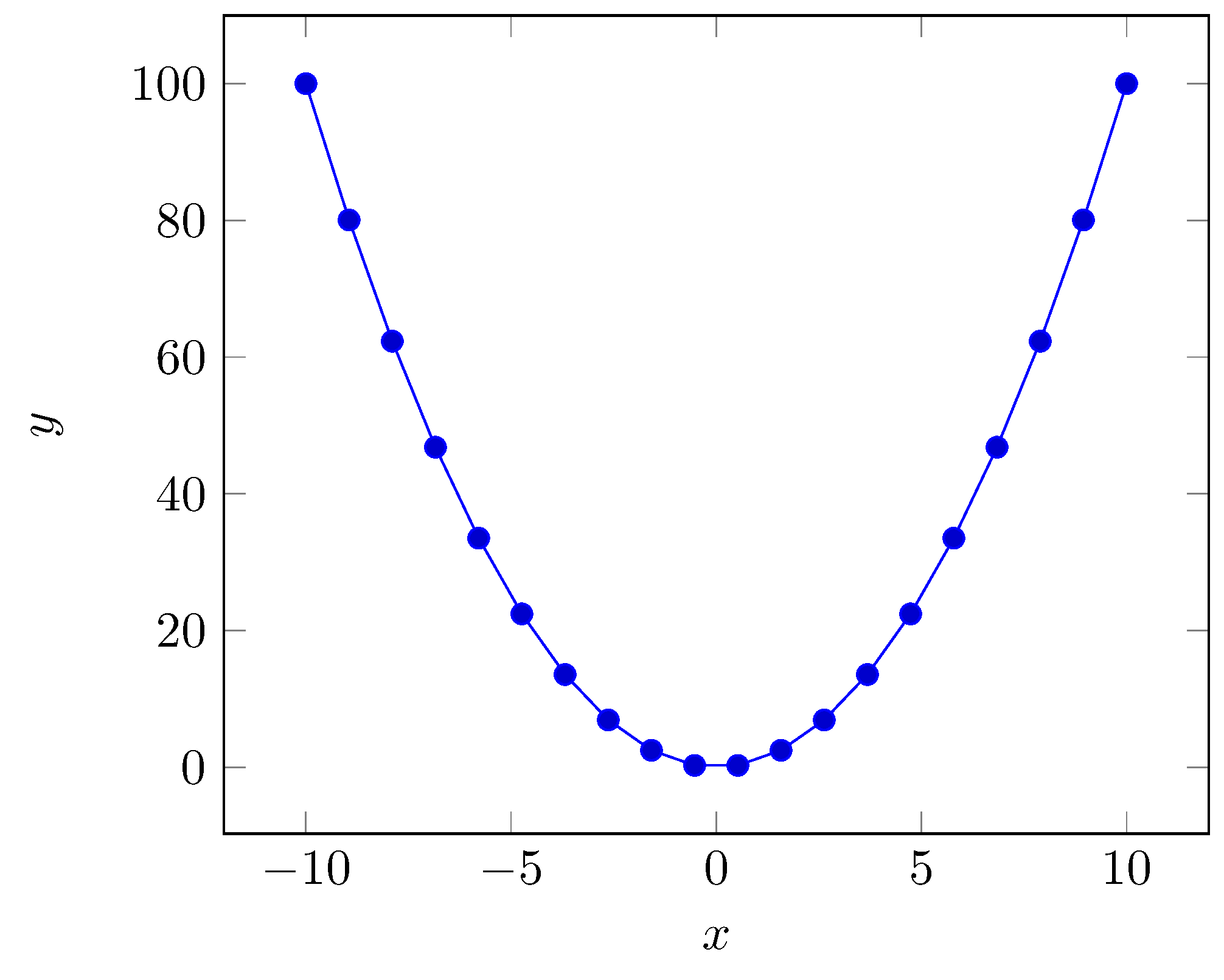
Let’s start with a quick example to see how easy it is to do. In the following snippet. This is provide an entry point to us.
First we begin with tikzpicture environment. For 2D plots we are use axis. Inside squared brackets we define axis properties like xlabel, label. Since we will be use mathematical expressions in this example we will define a domain lying from -10 to 10 in x axis and we will take 20 sampling point along this path.
\begin{tikzpicture}
 \begin{axis}
  [
  xlabel={$x$},
  ylabel={$y$},
  domain=-10:10,
  samples=20,
  ]
  \addplot {x^2};
 \end{axis}
\end{tikzpicture}
It will produce following graph.
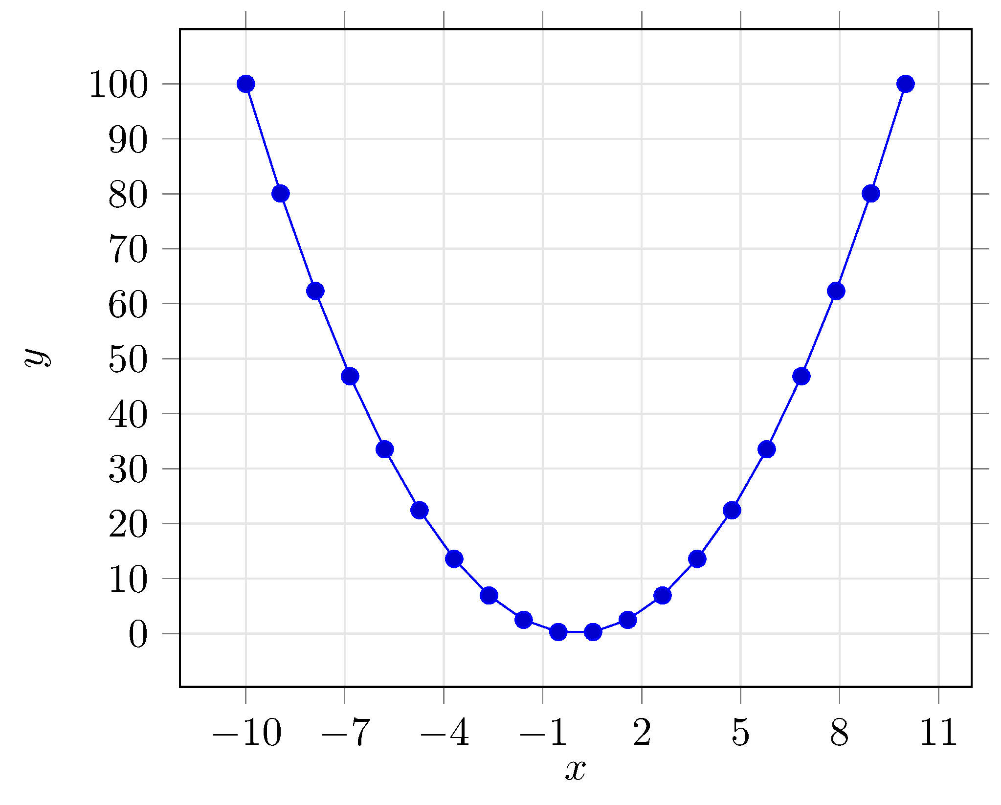
Adding more options
Let’s add a grid, change grid to a thinner and lighter version, move the thicks to outside of axes. Also let’s define ytick settings and xticks settings. We can defined how often we will have ticks.
grid=both,
major grid style={thin,color=black!10},
tick align=outside,
ytick={0,10,...,100},
xtick={-10,-7,...,10},
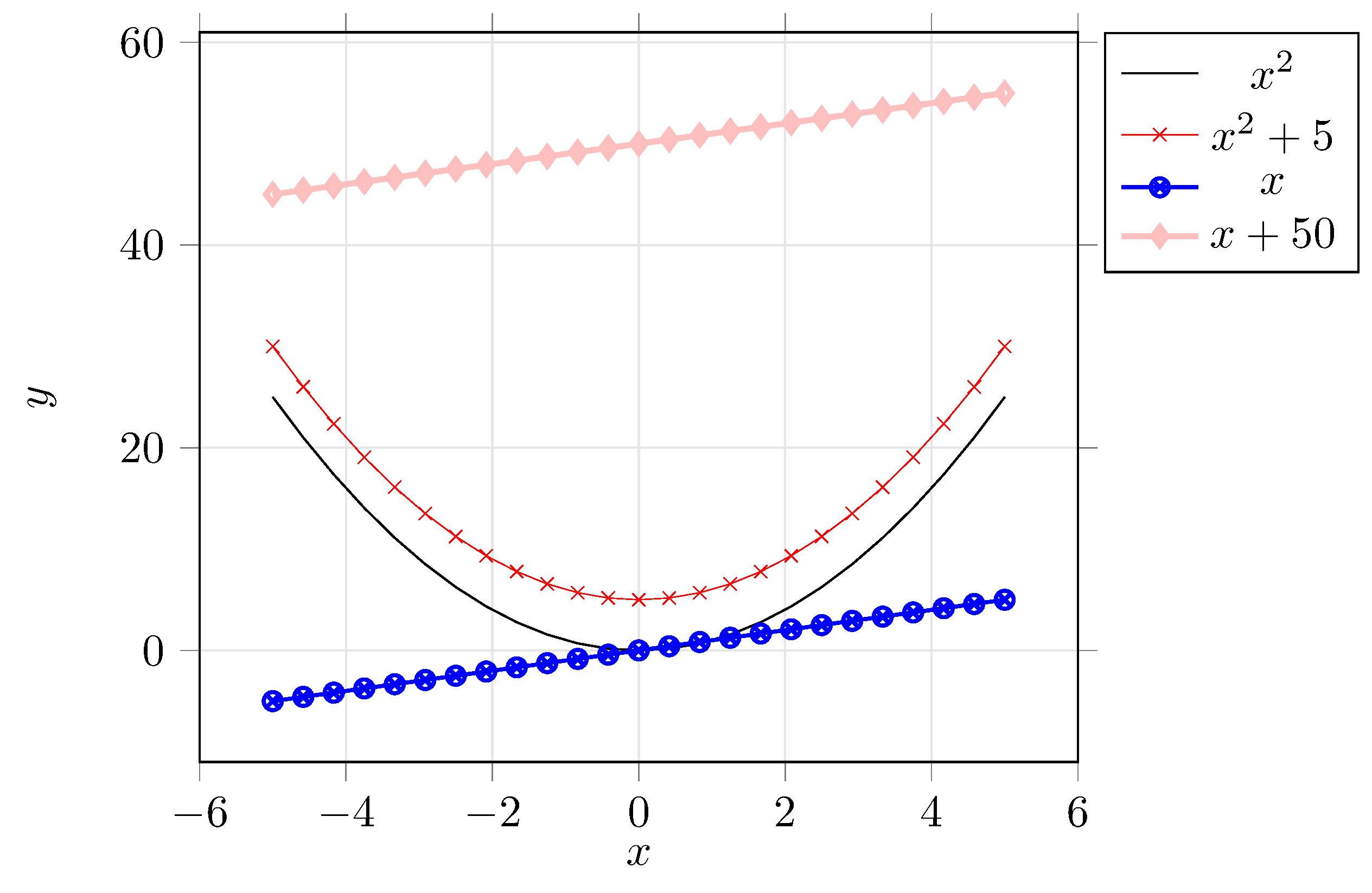
We can also specify color of lines,marker and thickness. Here some examples.
\addplot [no markers, color=black] {x^2};
\addplot [mark = x,color=red,very thin] {x^2+5};
\addplot [mark = otimes,color=blue,thick] {x};
\addplot [mark = diamond,color=pink, very thick] {x+50};
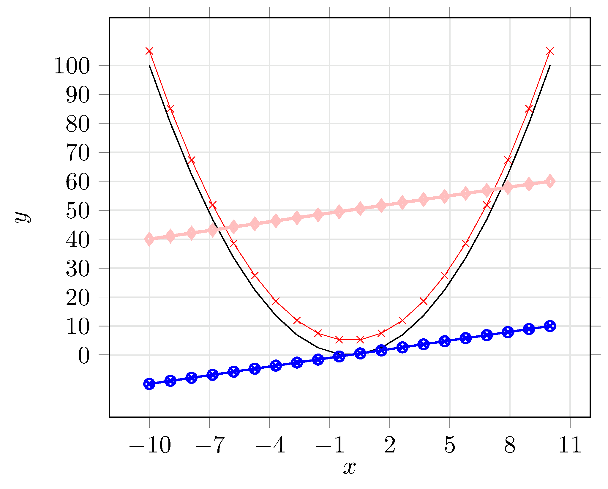
Oh, we are adding more equations but there is no legend. How can one know which is which equation right?
We can add legend entries at after adding a new plot there is 2 style is available
\addplot [no markers, color=black] {x^2};
\addplot [mark = x,color=red,very thin] {x^2+5};
\addplot [mark = otimes,color=blue,thick] {x};
\addplot [mark = diamond,color=pink, very thick] {x+50};
\addlegendentry{$x^2$};
\addlegendentry{$x^2+5$};
\addlegendentry{$x$};
\addlegendentry{$x+50$};
Or
\addplot [no markers, color=black] {x^2};
\addlegendentry{$x^2$};
\addplot [mark = x,color=red,very thin] {x^2+5};
\addlegendentry{$x^2+5$};
\addplot [mark = otimes,color=blue,thick] {x};
\addlegendentry{$x$};
\addplot [mark = diamond,color=pink, very thick] {x+50};
\addlegendentry{$x+50$};
Default position for legend entry is north east, one can override that settings adding legend pos option to axis options. This is based on geographical locations. It can be placed on south west|south east|north west|north east|outer north east. By default legends are boxed, using legend style option {draw=none} we can remove outer box of a legend.
[
legend pos=outer north east,
legend style={draw=none},
]
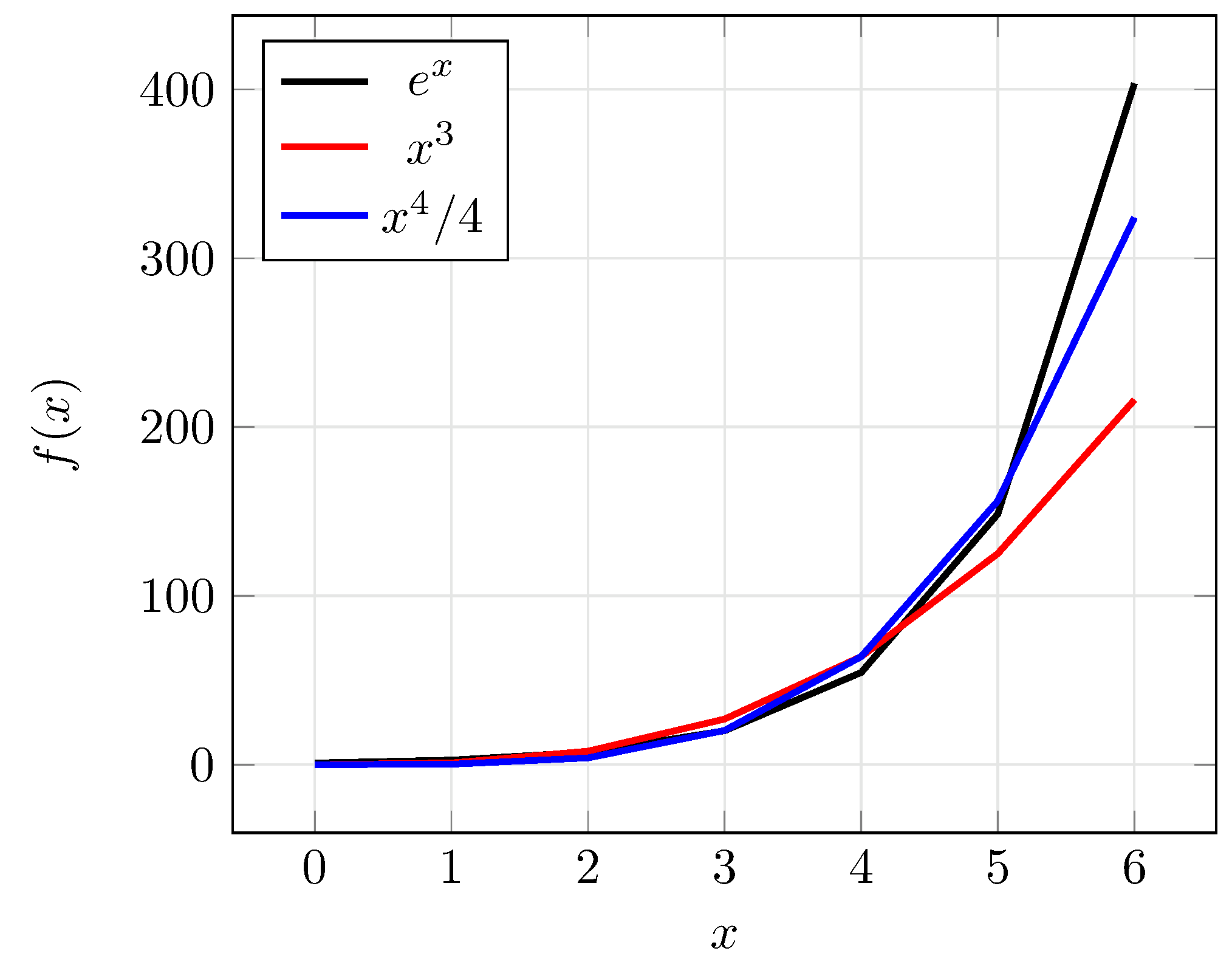
Plotting CSV Files
Generally we deal with plotting some data obtained from another source. One can easily store those values in a CSV file like below
x,entry1,entry2,entry3
0,1,0,0
1,2.71828182845904,1,0.25
2,7.38905609893065,8,4
3,20.0855369231877,27,20.25
4,54.5981500331442,64,64
5,148.413159102577,125,156.25
6,403.428793492735,216,324
Here we have 4 columns they are seperated by comma and first line gives the header for the values.
Plotting such kind of data is a really easy task to do.
\addplot [plot options] table [table options] {./path/to/data.csv};
Plot options are similar to what we have done above. The new entry table basicly need 3 option. We need to speficy header of x values, y values, and the column seperator used in data file.
Here an example.
\addplot [no markers, color=black, very thick] table [x=x, y=entry1, col sep=comma] {./data.csv};
\addlegendentry{$e^x$};
\addplot [no markers, color=red, very thick] table [x=x, y=entry2, col sep=comma] {./data.csv};
\addlegendentry{$x^3$};
\addplot [no markers, color=blue, very thick] table [x=x, y=entry3, col sep=comma] {./data.csv};
\addlegendentry{$x^4/4$};